18 Jan 2011

JVL things

I decided today that I would spend a little time to clean-up my old and very quickly drafted model sheets for the the internet viral I produced for JamesVonLeyden.com.


I think I prefer the old and sketchyer version as the cleaned up attempt seems to have lost its character a little?

NEW:


OLD:


Will be posting up old storyboards, character and font designs as well as the completed animation in the next few days. 

A few days later...(02/05/11)

To begin with I was a little confused about who this Katie character was and which angle to take the animation.  I started doing some drawings of her in different costumes and different roles such as Band player(see with 'Katie' and musical notes coming from her trumpet), lion tamer/ circus leader, and a painter/ decorator which I quite liked the idea of with the website in painted letters on a billboard. At that time the company was under the name 'Yorbrand'.
Later there was the suggestion that it should be set at Halloween so I was to focus on snazzy and jazzed up costumes to put her in (such as the cat and ghoul outfits).
 

Katie is meant to be the fun, vibrant selling point of the company so there had to be contrasting characters or brands which are alot more un-appealing and dull (black and white). Again, a few teething problems and experimenting with styles so heres some rejects as well as the successful characters which were used in the beginning of the ad. I particularly like my onion-faced kid on the 1st row. Some of these were seen as too elaborate and quirky looking which would take the focus from Katie so they were rightfully rejected. This was probably the funnest part next to animating.


Once we established it would be a halloween theme I started playing with text that we might use and some background characters for the grand finale. I didnt end up using any of this as we dropped the name Katie and the focus would be on jamesvonleyden.com.


I loved this guy and wished I had time and reason to add him into the final animation but it would have taken alot of time to animate him and add other characters in so he didnt seem out of place.

This is aweful storyboarding but James seemed to understand where I was going with it. We lost the pumpkin goo which I though would be a cool way to spell out the 'www.' and Katie present the branding name with her spells etc. Theres alot we kept and alot that got cut out from these simple doodles which I used more as a map for what the animation would look like.


 I wish I could have gotten her in a top-hat and tails/ Ghoul outfit in the animation at some point too XD:

These were the designs before we got rid of the Katie motif as shes holding a staff with the letter 'K' on it in these versions.


These were some more early development drawings but I kept the idea of writing on the back of her wings in the final animation only it displayed the words 'Trick or Treat' instead of Katie. We also lost her cat outfit incase the audience got confused but added cats in instead to juggle pumpkins.


Early bat design (didnt like the colours here at all)


As you can see the old storyboard fared me well with the transformation from Witch to bat costume in the final cut. I made sure the design would enable me to nicely metamorphasise between these two costumes i.e the bat-wing skirt becomes her wings and her hat is squashed into ears as she performs her cartwheel.


This was probably my favourite part of the animation. I checked out different videos on Youtube for cartwheels and backflips. I mostly liked adding the delayed actions/ long inbetweens in the arms and legs as they move in their arcs; it makes for interesting stills as well as less inbetween drawings in the animation process.

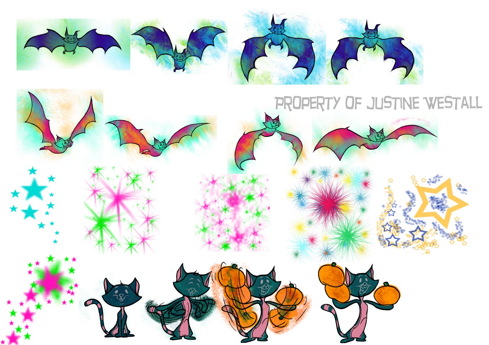
These are the simply animated background elements used in the 'finale' of the ad. I used 4-5 Bat frames, one facing forewards and one taken from a side view. Before Katie releases the magic she flips into position between two cats juggling pumpkins;the movement of which I took from footage of guys juggling from Youtube. I coloured and duplicated the bat frames and placed them all over the screen to make it look as though she had released them by magic. I also rotated, skewed and animated the stars and puffs (shown as separate PNGs) to make it seem more magical.

More to come soon!

6 Jan 2011

2011, Making a better animator out of myself..

The last few days have been significantly productive; constructing new showreel and new material for it etc. However, when choosing material for my showreel I wished I had more classic exercises to show that I could use character models and could animate a classic sequence. Ive done alot of my own animations which are based on my model sheets but being your own boss and creator has its massive disadvantages.

When animating my final film for Uni, I found I improved on my characters all the time which meant that updating my model sheets was a regular occurrence and a pain in the arse. Being my own boss also meant that I could get away with things..because I wasn't about to call myself into an office and punish myself! So...this is why Ive finally decided to sit my keester down and animate a few movements from an Oswald Rabbit dance sequence which Jon K posted up, what seems like years ago.

Whilst drawing out the roughs of the Oswald Keys I took it upon myself to be a massive hard-ass perfectionist. If I was going to do this I had to do it properly.

Oswald Frames
 'Simple',I hear you say. 'Shouldnt take you long', you exclaim! Well actually NO

I challenge any animator or artist to get this little bugger down to a T on their first attempt, it wont happen unless you are an animation genius!

Drawing Oswald is made all the harder by the darkness of his surroundings and the quality of the print. As its in black and white, the black tones of Oswald's fur even hides the details of his fingers unless they are silhouetted. This also makes it doubly hard to see the negative spaces between his limbs and his body not to mention the complication behind the white detail on his face and the black of his head! All in all this character comes across sweet and innocent (when it comes to drawing him) but really its a fine lesson to be learnt; even with its seemingly basic construction Jon K asks young animators to start here because if you can master this you can master almost anything.

My attempt
 Yesterday I was all over these drawings. I felt confident with what I was about to set out and do and I spent alot of time correcting and going back into my drawings. The 1st attempt (above) is clearly the worst. It takes some getting used to to get the proportions right, shapes and the pose.
 Alas, my little joi was short-lived when I moved onto the next step of my development exercise:

As you can see, my version of Oswald was slightly...oky ALOT different to the original. Ive broken it down to label my mistakes:
 As I start with the head for most of my drawings, I failed at the 1st hurdle with this attempt. The head is too small but the body was almost spot on, minus the shorts. The legs were way off, possibly because I measured the right leg along the right arm's placement, which was also wrong. As I had drawn the arm and right leg, I then measured the space between the right and left leg and proceeded to draw the left side. The left arm isn't such a disaster but was a little too large and slightly the wrong angle, as with the ear.
Oswald Frame 2

 This was slightly less of a disaster. This time I drew with alot more confidence and pace and completed the drawing in little under half an hour.  However, I still miscalculated the size of the head and placement of the legs. I did however hit the mark alot more than on my 1st attempt. The body was more or less spot on, in shape and placement as with the arms. The problem with the darkness of the shot and the blackness of the body hindered me succeeding with the arms but I feel I did the best I could here. The Left leg is also spot on but went a bit South with the foot's position, size and angle. The right leg is a complete fail in general possibly because I modelled it on the distance and angle I has drawn the right ear.

I will be making another attempt at these drawings and I will certainly be checking them this way again because I think theres alot to be learnt and gained from this type of self criticism. Had I not checked my drawings against the originals I probably would have been quite happy with what I had drawn and not given it any more attention. I think Ive become a little lazy in some respects especially with things like this. Its so important to have good structural skills so I will be making a conscious effort to make myself be good at it.